






Asking yourself, what is my home decor style, usually happens right after you buy a lamp that looked stunning in the showroom but looks completely lost in your living room. We have all been there. Finding your true aesthetic is less about rigid labels and more about how you actually live every day.
1. The Wardrobe Translation Technique
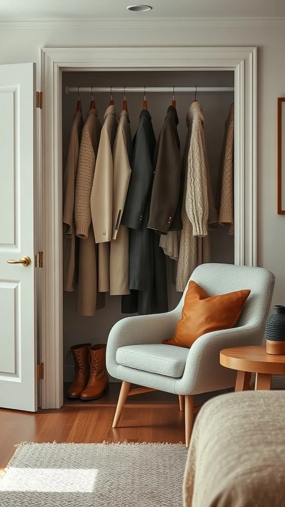
Look right inside your clothes closet. It tells the truth before your Pinterest boards even load. If your wardrobe is packed with relaxed linen button-downs, broken-in denim, and buttery leather mules, you will never feel comfortable living in a glossy, high-shine minimalist condo. Your clothes reveal your natural tolerance for structure versus slouch.
Check the dominant fabrics hanging in your closet right now. When you cross-reference your everyday outfits against our detailed interior design styles list, patterns jump out fast. Heavy knits translate into textured boucle and waffle throws. Crisp blazers translate into tailored sofa cushions with neat welted piping.
💡 Pro Styling Move:
Pull out your three absolute favorite items to wear. Lay them on your bed. Whatever colors, textures, and metals appear across those three pieces should dictate your living room rug and upholstery palette.
2. Assess Your Structural Taste: Soft Curves and Architectural Lighting
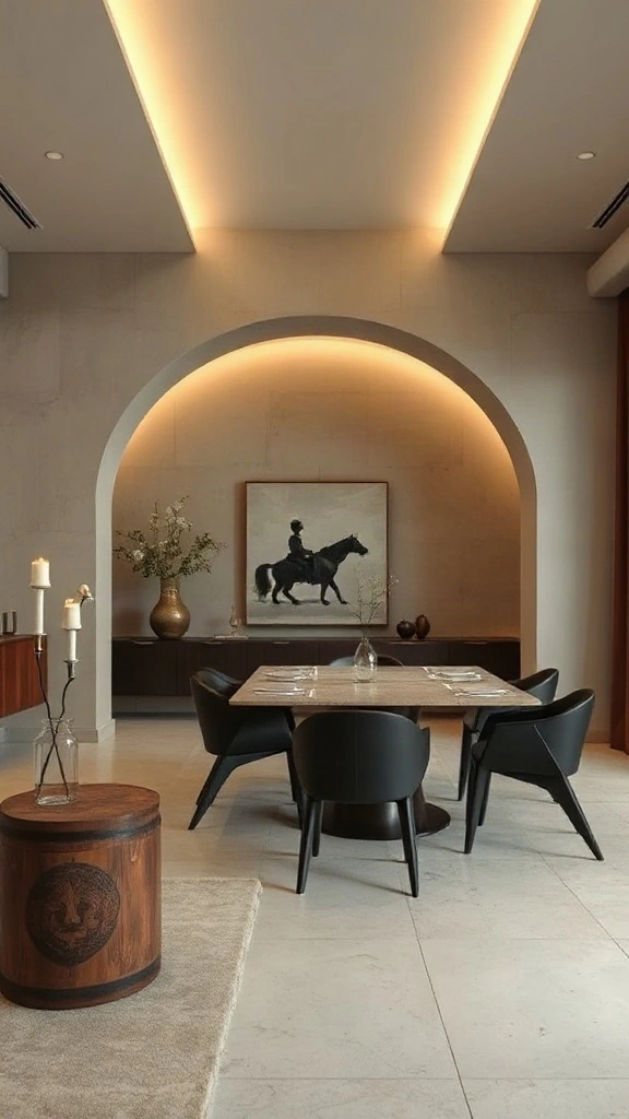
Structure dictates feeling before furniture ever arrives. I notice people get stuck choosing cushions when their real battle is with hard angles. If sharp 90-degree drywall corners make you feel tense, you lean toward an architectural lighting home decor aesthetic. Soft lines calm the eye immediately. A curved archway cove lighting aesthetic gives any basic builder-grade floor plan an editorial look without gutting your layout.
Tuck warm 2700K LED tape behind a floating false bulkhead or inside a shallow wall alcove. It completely changes how shadows fall across your space. When exploring different types of interior decoration, look at structural lines first. Strong arches suggest Mediterranean or European revival, while sharp, linear beams tilt industrial.
⚠️ Where People Go Wrong:
Do not install cool-toned 4000K or 5000K LED strips inside coves or arches. They make living rooms look like commercial hospital corridors. Stick strictly to 2400K or 2700K warm fixtures.
3. The Biophilic Test: Using Foliage and Terracotta to Define Balance
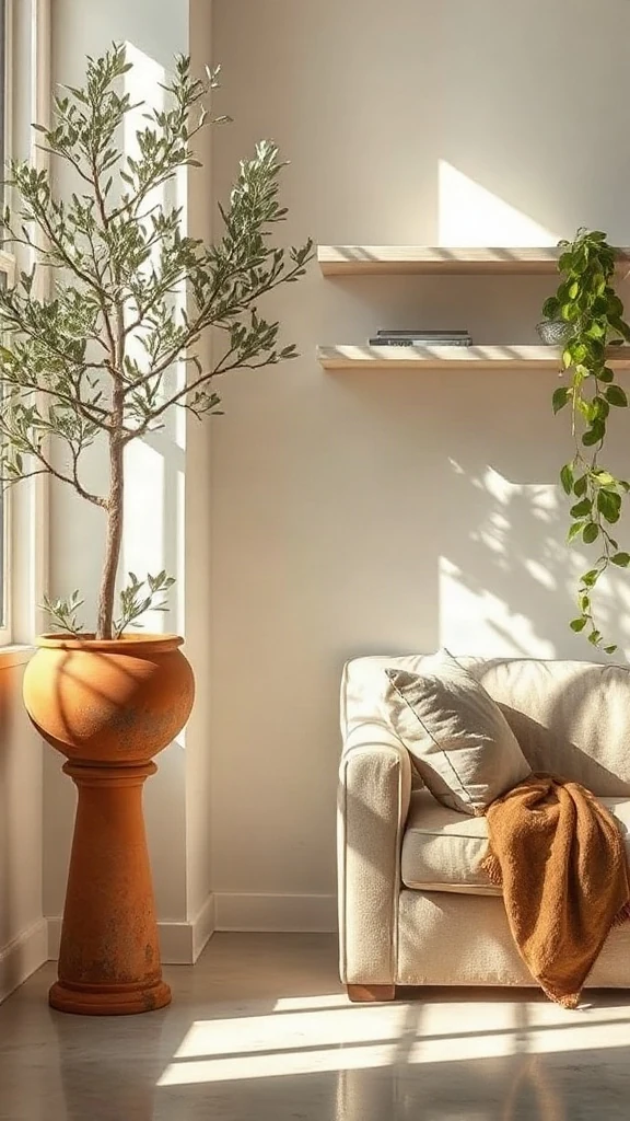
Plants are the ultimate aesthetic diagnostic tool. In my own studio tests, plant styling proves where your heart sits among various styles of decor. If you love wild trailing vines on every open bracket, you belong in a relaxed, bohemian space. If you prefer a single seven-foot fiddle leaf fig in a clean fluted vessel, modern organic is your match.
Try indoor plant styling for interior aesthetics by auditing your pots. Switch glossy painted plastic pots for heavy, salt-crusted Tuscan terracotta. That single change shifts a room from generic apartment living to grounded organic luxury. Use greenery as your biophilic interior design style finder to gauge how much organic imperfection your eye tolerates.
💡 Pro Styling Move:
Group plants in odd numbers using varying heights. Place your tallest floor plant at least 12 inches away from corners so daylight wraps all sides evenly.
4. The Hands-On Gauge: Custom Finishes and Fluted Woodwork Hacks
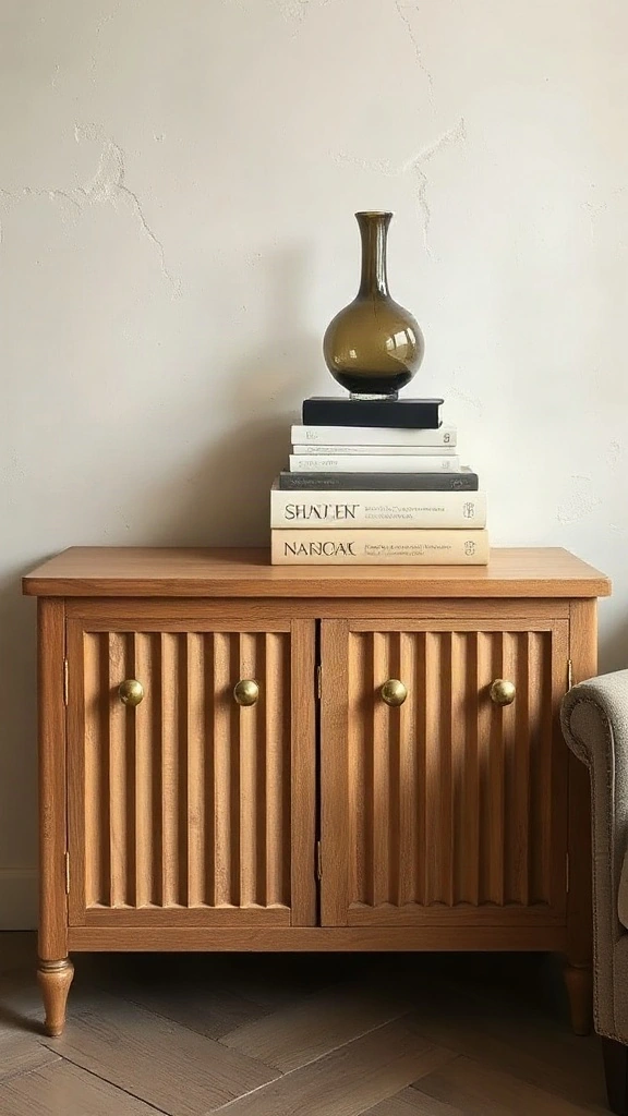
You do not need a massive budget to discover your interior design style. A tiny weekend DIY will teach you more than months of scrolling social feeds. Grab sample boards and run a limewash wall finish home style test in a small hallway. Limewash has a cloudy, chalky depth that flat latex paint simply cannot mimic. If you love that chalky patina, your style embraces old-world Wabi-Sabi or Tuscan modernism.
Prefer tailored precision instead? Build a custom fluted wood furniture aesthetic by adhering half-round moulding or flexible fluted pole wrap around an inexpensive storage cabinet. It reveals whether you crave tailored mid-century lines or rustic simplicity. Take this as your physical diy home decor style quiz.
⚠️ Where People Go Wrong:
Never apply limewash straight over glossy latex without an acrylic primer coat. The minerals need a gritty, porous foundation to bind properly, or the paint peels right off in damp weather.
5. The Lighting Contrast Calibration
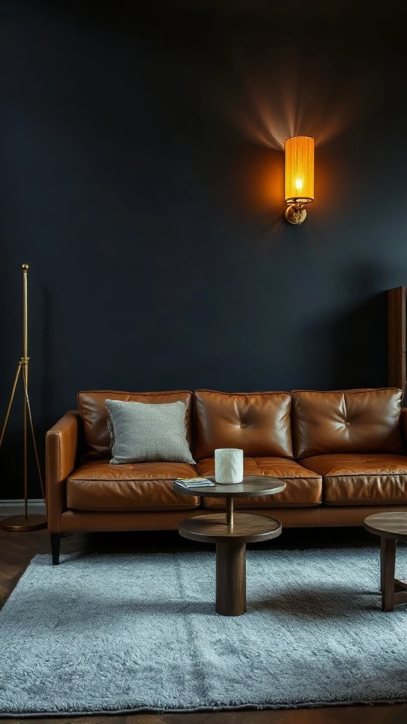
Turn off your ceiling overhead light. Right now. How does the room feel? If you feel anxious when a space is dim and shadowy, you naturally thrive in Scandinavian, coastal, or breezy transitional aesthetics where natural sunlight rules. If you immediately relax when small accent lamps cast pockets of warm amber light, you belong in a moody, historic, or clubby library aesthetic.
I advise clients to test their light thresholds by placing three small task lamps around an empty seating corner. Skip the big central pendant. Read curated articles in the Architectural Digest design archives to see how high-end rooms handle moodiness. Lamps placed at chin level create intimacy that overhead fixtures kill every single time.
💡 Pro Styling Move:
Spread lighting across three distinct heights: low table lamps at 30 inches, floor lamps at 58 inches, and subtle art lights at eye level. This creates visual depth instantly.
6. The Three-Word Aesthetic Filter
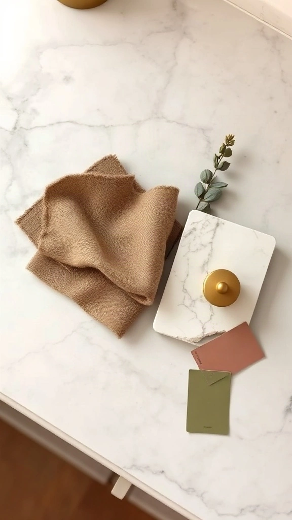
Design fatigue is real. When you walk through a big home goods warehouse, every single vignette looks tempting. You end up buying mismatched pillows that make zero sense together. To stop the cycle, define your decor through exactly three descriptive words. My favorite example is: Grounded, Tailored, Earthy.
Use those three words as an unyielding filter for every checkout cart. If an item does not tick at least two of your words, put it back on the shelf. This technique weeds through confusing types of decor styles so you never waste cash on impulsive decor clutter. It keeps your vision razor-sharp.
⚠️ Where People Go Wrong:
Avoid using empty generic words like modern, pretty, or stylish. Use sensory feeling words like weathered, tailored, dramatic, crisp, airy, or rustic to guide your shopping decisions.
7. Tactile Material Mapping
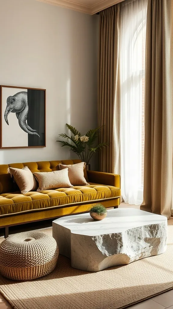
Touch everything before you buy it. Your fingertips understand your aesthetic faster than your eyes do. A polished chrome table feels icy, sharp, and futuristic. A rough-sawn oak bench feels grounded and familiar. If you find yourself petting velvet cushions or running hands along raw stone edges, lean straight into tailored, sensual fabrics. If this tactile intimacy calls to you, explore our ideas for romantic master bedroom decor to see velvet and linen combinations in action.
Try material mapping on a single armchair. Pair a dry linen sofa with a buttery cognac leather side chair and an unpolished travertine side table. The tension between rough and smooth surfaces gives rooms a lived-in character that flat catalog setups always miss.
💡 Pro Styling Move:
Always include at least three contrasting textures in a room: one coarse weave (boucle or jute), one smooth surface (honed stone or polished wood), and one soft drape (linen or velvet).
8. Architectural Bones and Era Alignment
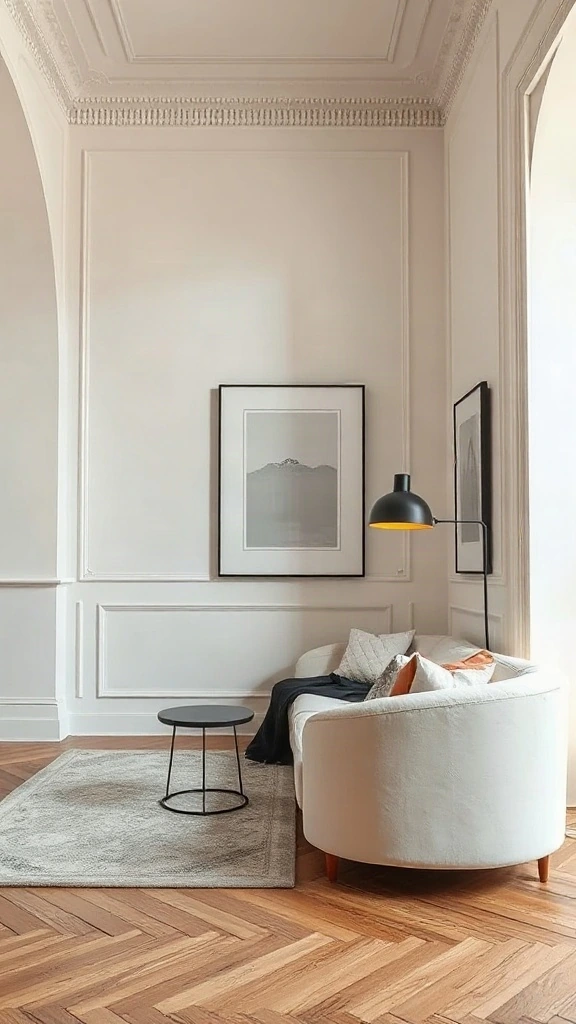
Do not fight your home’s structural bones. It is exhausting, and it drains your bank account. Installing ultra-sleek, glossy Italian acrylic cabinets inside an 1890 Victorian townhouse feels disjointed. Putting heavy gothic carved oak inside a mid-century glass pavilion creates friction. Honor the envelope your space provides while weaving in your personal pieces.
If you have wide open drywall expanses and feel overwhelmed, learning how to decorate a large wall in living room spaces lets you introduce picture moulding without structural demolition. Match the scale of your furniture to your ceiling heights. Keep sofas low if ceilings sit at eight feet.
⚠️ Where People Go Wrong:
Never rip out original vintage wood trims or historical mouldings just to chase a fleeting trend. Work with existing details and layer modern furnishings over historic architecture instead.
9. The Tray Vignette Mini-Trial
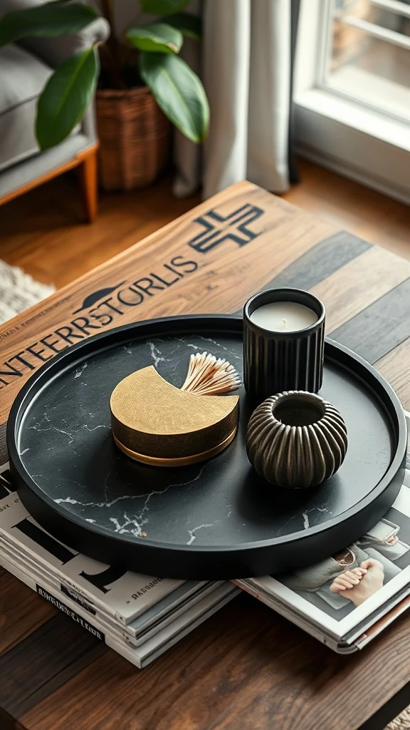
A full room renovation feels terrifying. A coffee table tray is totally manageable. I always recommend styling an isolated 16-inch round tray before spending thousands on sofas. Collect five objects you cherish from around your home and arrange them together on the tray. Notice what naturally clusters there.
Did you pick a vintage brass compass, an aged match striker, and an antique leather box? You lean traditional eclectic. Did you pick a single polished chrome bud vase and an architectural concrete cylinder? You are a minimalist modernist at heart. Small trials give you instant confidence before making big furniture purchases.
💡 Pro Styling Move:
Keep vignettes limited to three distinct heights. Place one flat book stack, one medium vessel or candle, and one tall sculptural branch or taper holder for balance.
10. Color Temperature Gut Check
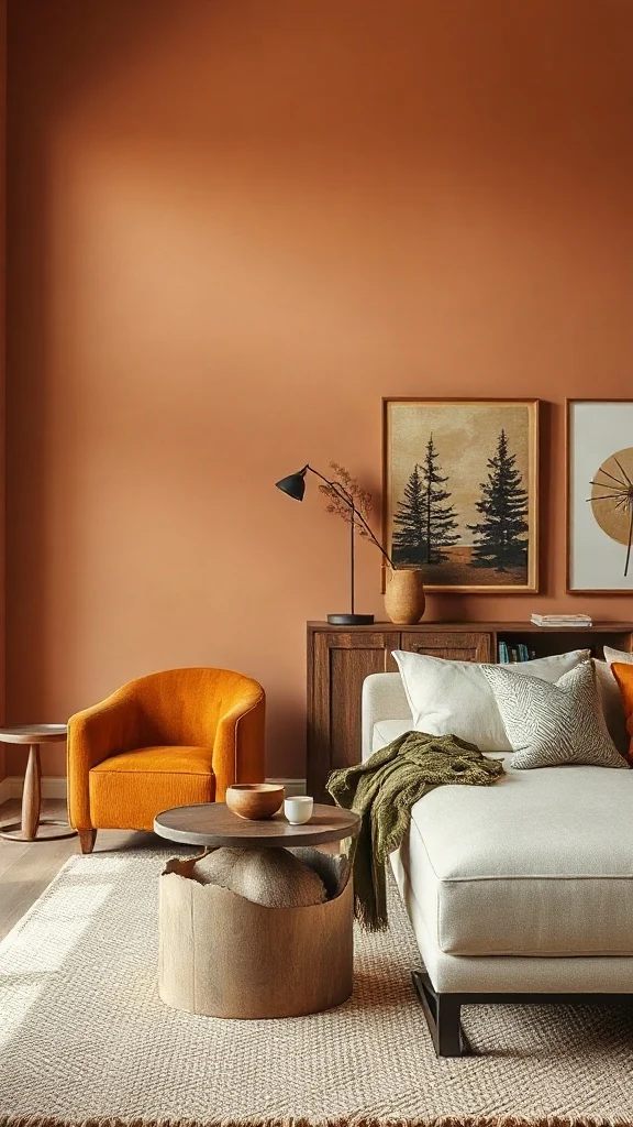
Paint color paralyzes people. I see homeowners holding fifty tiny paint swatches against a wall looking completely stressed out. Stop looking at fifty colors. Narrow your choice down to one question: Do you crave warm yellow-red undertones or cool blue-green undertones? That single choice cuts away half the noise immediately.
Test large 12×12 inch adhesive swatches on north and south walls using professional swatches from Sherwin-Williams color selection tools. Cool tones give a crisp, airy, modern gallery vibe. Warm tones bring comforting, cocooning historic charm. Live with the sample for three full days before painting the whole room.
⚠️ Where People Go Wrong:
Do not judge a paint swatch under hardware store fluorescent tubes. Bring the swatch home and check it at 8 AM, 2 PM, and 8 PM under your actual lamps.
11. Rug Anchoring and Visual Gravity
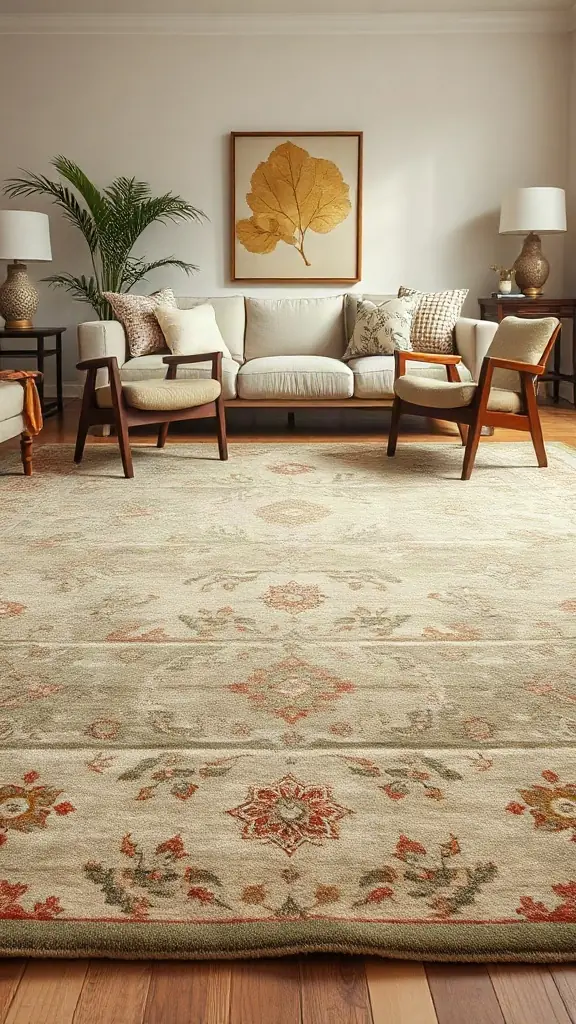
A postage-stamp rug ruins an entire living room. I see it constantly: an eight-foot sofa hovering over a tiny five-by-seven rug like a raft floating in a giant ocean of hardwood floor. It shrinks the room and makes the layout look awkward. Your rug determines whether your style feels grounded and generous or temporary and haphazard.
If you love quiet serenity, pick a chunky woven wool loop in unbleached cream. If you lean traditional, choose a faded Turkish vintage runner with low pile and historical motifs. Make sure your rug is large enough so at least the front feet of all major seating pieces rest securely on it.
💡 Pro Styling Move:
Always leave 10 to 18 inches of bare hardwood floor exposed between the edge of your area rug and the baseboards to maintain proper room proportion.
12. Hardware and Metal Finish Pairing
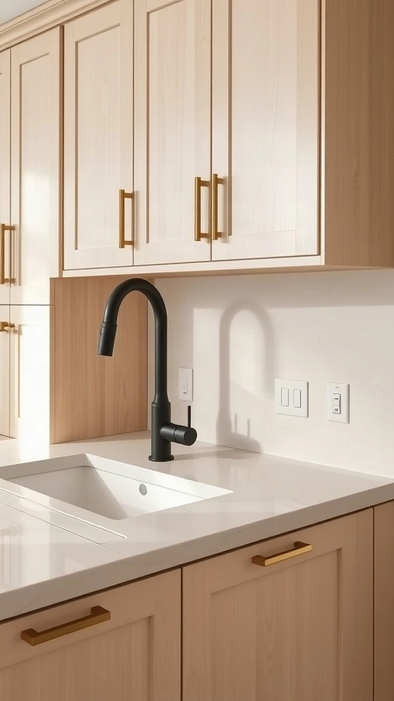
Cabinet handles and plumbing fixtures act like jewelry for your rooms. They reveal whether your aesthetic leans sleek and restrained or soulful and layered. Matching every single knob, faucet, and hinge in the exact same finish makes a space look like a builder showroom pack. Mixing metals intentionally makes it feel collected over time.
Stick to a dominant metal and an accent metal. Pair warm unlacquered brass pulls with an understated matte black faucet. The brass ages with a living patina that records fingerprints and cooking steam. If you love clean surfaces that never show fingerprints, opt for brushed stainless steel instead.
⚠️ Where People Go Wrong:
Never mix more than two distinct metal finishes in a single compact room. Three or more competing metals in a small space look chaotic rather than curated.
13. The Negative Space Tolerance Audit
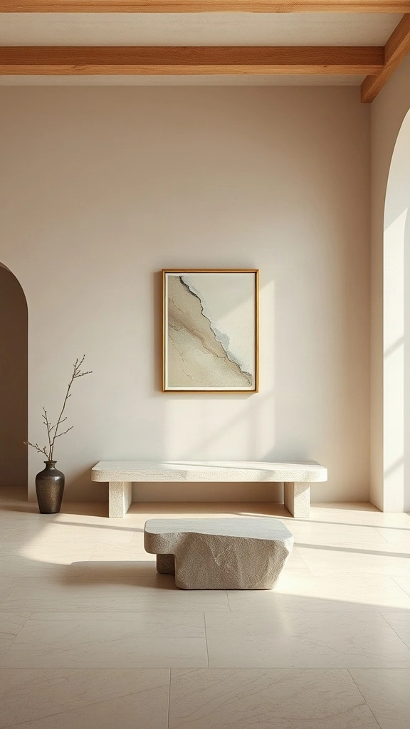
I walked into a client’s living room last spring where every square inch held furniture. She felt chronically overwhelmed. We stripped an entire 14-foot wall down to bare plaster. Total huge upgrade. Your comfort with emptiness directly defines your decor lane. If blank walls feel sterile, you lean maximalist or traditional. If they breathe peace, minimalism calls. It never lies.
Test your tolerance by clearing a 6-to-8-foot wall zone completely for forty-eight hours. Gradually reintroduce one large-scale piece, leaving at least 18 inches of breathing margin on all sides. Note your physical reaction before adding secondary decor layers like floating shelves or gallery frames.
💡 Pro Styling Move:
Follow the 60-30-10 surface rule: leave 60% of visible flat planes (consoles, coffee tables, wall segments) unadorned, allocate 30% to sculptural focal anchors, and reserve only 10% for tiny accents to establish refined, intentional luxury.
14. The Bookcase Curation Stress-Test
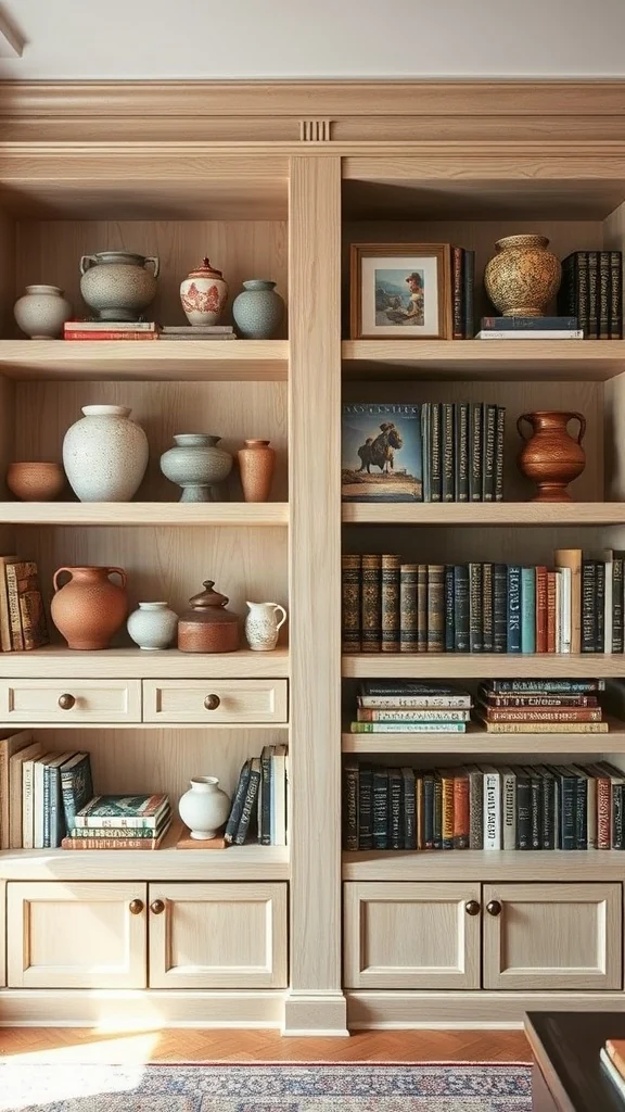
Whenever clients struggle to label their aesthetic, I walk straight to their shelving. Shelves reveal subconscious priorities. One homeowner organized her entire collection strictly by spine gradient. She craved polished control. Another piled vintage paperbacks sideways beside weathered flea-market ceramics. Soulful eclectic. Your natural instinct between rigid symmetry and relaxed, found-object layering tells you everything about your authentic aesthetic home. Trust it.
Style a single 36-inch shelf bay using the two-thirds rule. Fill two-thirds of the horizontal run with spine-out books grouped in sets of five to seven. Balance the remaining 12 inches with a solitary, substantial sculptural object standing at least 8 inches tall.
⚠️ Where People Go Wrong:
Turning book spines backwards to force a neutral palette strips a room of personality. If visible book colors clash with your calm aesthetic, edit down the volume count instead of hiding titles, or house busy paperbacks inside textured linen storage boxes.
15. The Window Treatment Density Gauge
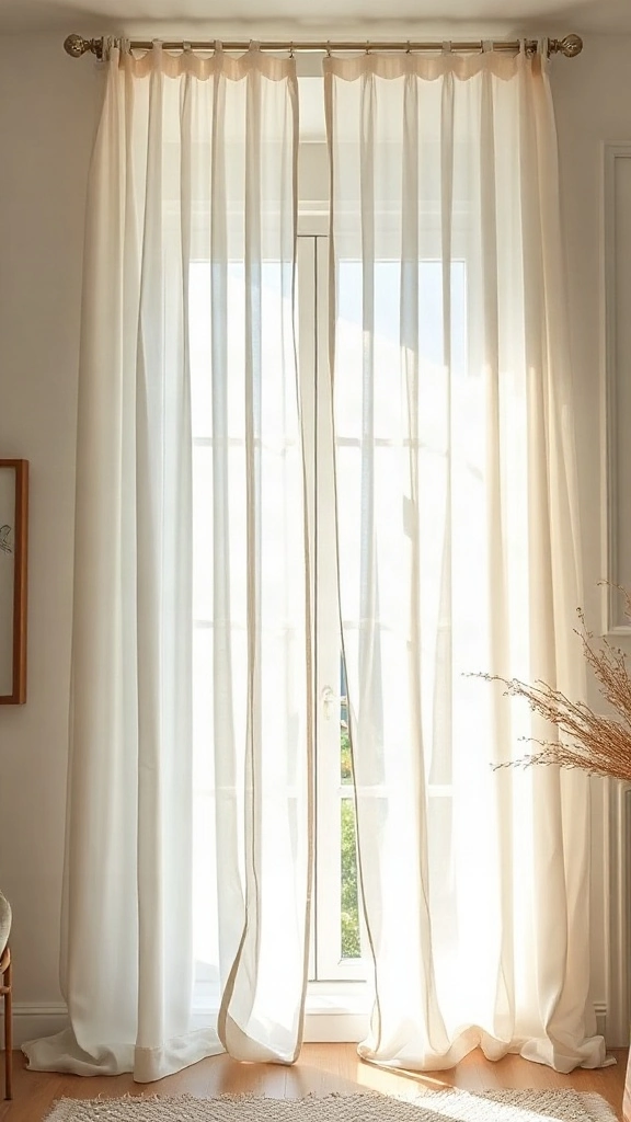
I always inspect how people frame their windows. Curtains dictate atmospheric mood. A couple I advised insisted on heavy velvet drapes with bullion fringe in a modest mid-century condo. Big mistake. It choked the architecture. Light-filtering linen panels instantly restored equilibrium. Are you drawn to puddling formal silks, crisp architectural roller shades, or breezy raw linens? Window treatments reveal your desired balance of formality and ease.
Hang your drapery rod 4 to 6 inches above the window frame, or tight to the crown molding, and extend brackets 8 to 12 inches wider than the casing. This lets fabric stack off the glazing when drawn, maximizing natural light while broadcasting effortless, high-end verticality.
💡 Pro Styling Move:
Aim for a ‘kiss’ or a gentle half-inch break on the floor rather than severe pooling. Tailored linen drapes with a 2.5-times fullness ratio deliver that relaxed European transitional elegance without gathering household dust or pet hair.
Master Comparison: Key Approaches at a Glance
| Approach / Style | Best For | Space Requirement | Estimated Cost | Key Styling Pro Tip |
|---|---|---|---|---|
| Organic Modern | Lovers of warmth, quiet neutrals, and raw natural textures | Any room size | $300 – $1,200 | Layer unfinished white oak with oatmeal linen. |
| Transitional Classic | Balanced spaces wanting traditional comfort with crisp lines | Medium to large spaces | $400 – $2,000 | Mix antique wood pieces with modern metal framing. |
| Moody Japandi | Uncluttered living rooms with deep contrast and soft daylight | Small to medium rooms | $250 – $900 | Keep furniture low profile and use rice paper pendants. |
| Curated Eclectic | Thrift lovers, art collectors, and vintage seekers | Flexible layout | $150 – $800 | Unify wild artwork with matching black or walnut frames. |
| Modern Parisian | Spaces with historic moulding, tall ceilings, and velvet seats | High ceiling spaces | $500 – $2,500 | Hang an ornate gilded mirror above an ultra-clean sofa. |
Frequently Asked Questions
What if my partner and I have completely different home decor styles?
Find your common ground in materials rather than overarching themes. If one loves mid-century modern and the other loves farmhouse, agree on warm white oak and black accents. Let one style dictate the sofa’s clean profile while the other dictates the rustic coffee table and textile patterns.
How do I mix two distinct decor aesthetics without making rooms look messy?
Follow the 80/20 rule. Let one dominant aesthetic control roughly 80 percent of your space, covering large items like wall paint, flooring, and main upholstery. Use the remaining 20 percent for accent chairs, lighting fixtures, and quirky decorative items that introduce your secondary aesthetic.
Can my home decor aesthetic change from room to room?
Yes, but maintain a unifying red thread across doorways. Carry the same flooring tone or identical baseboard trim paint throughout your floor plan. This allows a moody, dark powder room to connect harmoniously with an airy, sun-drenched living room right across the hall.
How can I find my home style on a tight budget?
Focus on secondhand shopping and simple cosmetic upgrades. Scour local thrift shops and Facebook Marketplace for solid wood vintage pieces that carry character. A fresh coat of warm eggshell paint and thrifted brass table lamps can establish an elegant aesthetic for under two hundred dollars.
Conclusion & Styling Takeaways
Finding your interior design style is an evolving journey, not a rigid checklist. Stop worrying about fitting into a single trendy box. Trust your gut reactions to raw wood, mood lighting, and fabric textures. Pin your favorite moments from this guide to your Pinterest aesthetic boards, test small vignettes in your own space, and build a home that genuinely feels like you.